Tuesday, 16 April 2013
Thursday, 11 April 2013
Wednesday, 10 April 2013
Tuesday, 9 April 2013
Friday, 22 March 2013
Evaluation Draft: Task 7
7. Looking back at your preliminary task (the continuity editing task), what do you feel you have learnt in the progression from it to full product?
Since my preliminary task, I have enhanced my ability to use different software and technologies, as well as understanding the certain conventions and expectations of exisiting products and what makes a magazine appealing to an audience. Before completing this project, my skills on Photoshop were very limited and basic. However, since my preliminary work, I have become accustomed to how it works and the best way to use this to my advantage. I have learnt to use tools such as the 'magic wand' to erase the background from an image, as well as the 'lasso' tool, which meant that I could cut around an image almost perfectly. As you can see from my preliminary work, I did not know how to do this, and so the background is grey because that was the background of the image. I had to stretch the photo to fit the entire page, which was especially a problem when creating my contents page, and so ended up distorting the image just to fill the background.

When the time came to create my draft magazine, I still hadn't understood how to cut around an image with the lasso tool, although this didn't necessarily affect what I wanted to do much as it had with my preliminary, as I chose to keep the arty background within the image of my artist. I resized this and decided to use a plain white background to place the text over.

However, my final idea required a lot of cutting around several images, as I wanted my magazine to look particularly handmade in the style of a punk fanzine. In the transition from my draft to my final piece, I practiced cutting images out using the lasso tool and had also used the magic wand tool during the process of my draft cover, which enabled me to change the colour of the background behind my image, as it deleted the fill of the photograph.

In preparation for my final magazine, I spent a lot of time on Photoshop editing photos separately. This way I could decide how best to present my models and how they would fit on the page before creating the actual product. As I wanted all of my images to be separate, despite having taken my photographs of the band together, I had to look at each photograph and decide which image of each model was best and if I was able to cut it out from the images I had to work with. In the bottom left screen shot, I used only two images, and cut out the model on the right from the photo and chose another in which he had used better poses.
In the bottom right screen shot, however, I decided to change the image of the two models together because I didn't feel like they were right, and so I cut out two separate images this time and positioned them accordingly. I place the female model in the middle and slightly in front of the male band members, so as to create a natural look about the new image I had created. I played around with several different effects until I was happy with the way the images looked, and then saved them as one image.


This made the process of adding them to a separate document in which I was creating my contents page a lot easier (image below).


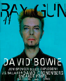
During the early stages of the project, I had never come across a punk fanzine in my life, and so my research and planning was vital in creating my final product. To being with, I was only aware of mainstream magazines such as NME, Q, Rolling Stone, Kerrang! etc. and so I thought my ideas were going to be limited. Having scowered the internet for other types of magazines, however, I came across some less well known magazines such as Raygun and developed my ideas from there, as I liked the style of this.
Having come across Sniffin' Glue, however, I decided to change my ideas again, and as my draft magazine had not ended up as I wanted it, I decided to completely push the boundaries and abandon all conventions of traditional magazines. The language register used in my draft articles and my preliminary work was very wishy-washy, and didn't really fit a particular genre. However, from the jump to my final piece, I amended this and began writing in a very particular way, including controversial headlines such as 'NO - 'hip' groups' and not shying away from taboo and slang, so as to conform to the punk style. From Sniffin' Glue, I found fanzines such as Sunday Mirra, Ripped & Torn and British Underground. I liked that these zines were handmade and looked messy, and so I adopted this style, but made my magazine look slightly more professional, as I continued to use Photoshop to create this image. As I was unaware of how to find fonts which looked similar to a 'drawn on' style, one of my teachers recommended I use the Bamboo Pen tablet, which would enable me to use the pen tool on Photoshop and draw onto the page digitally.


During my preliminary work, I did not focus on the mise-en-scene when taking photographs, as I was unexperienced within this field and did not know how best to go about taking photos. I used the school studio and one of my friends and quickly took a few photos to work with. However, during the drafting process of my magazine, I began to explore certain ideas and decided to take photos in a range of places, having thought long and hard about who I was going to take photos of. I took a more considerable amount of photos for my draft magazine than I did for the preliminary task, so that I had a range to choose from with various poses and costume choices.

When it came to my final piece, I set up the AV studio to compliment my models, chose what I wanted them to wear, and photographed them in front of the plain backdrop knowing exactly how I wanted them to look. I abandoned the idea of taking photos outside because of the weather and because it would make editing a lot easier if the models were in front of a white background.

Throughtout the production of my product, I feel that I have gradually progressed since my preliminary work and my draft magazine, and that my final magazine is much more effective and professional. The precision of my editing is of a much higher standard than my previous work, and I definitely feel like I have improved throughout the project.

Evaluation Draft: Task 6
6. What have you learnt about technologies from the process of constructing this product?
Computer/laptop:
I used the computers provided by the school to work on my practical work, as they had the softwear I needed to be able to construct my magazine, ie. Adobe Photoshop. These computers were available during lesson time, break time, lunch time and even after school. I used my laptop at home when completing most of the research and planning work, as all I needed to do this was the Internet and Blogger, which are of course, free. I had to carry out the research and planning work before I was able to create my final magazine, otherwise I wouldn't have known how to make a good piece.
Adobe Photoshop:
I used this program to construct my magazine, as it offered the most professional and efficient way of doing so. As it is easy to use, I was soon able to place images, edit text and add a number of effects to my work.
Although Photoshop was used more predominantly after the research and planning was carried out, we used the program at the start of the year and continuously throughout the course, so as to get used to how it worked and to improve our skills before it came to create our final piece.
Camera:
To take photographs of my models for my feature artist, I used my own camera and also the school's. I took photos in my own time and outside of school to begin with, and so used my own camera. However, I didn't think that these photos were to the best of my ability, and so I decided to use the school's camera and AV studio instead, as this provided me with a higher quality camera, a stand which I could place it on, a white screen which I could use as a plain backdrop, shelter from the weather conditions outside, and also access to the school's lighting, all of which I could tailor to my specific use. I organised photoshoots with my models in my own time once again, but was granted permission to do this in the school's studio.
Lighting/equipment:
The lighting provided by the school was easy to work with and had a massive effect on the quality of my images. Two separate standing lights were provided, which could be altered in height, angle and position, therefore casting the best possible lighting against the plain backdrop.
Scribd:
I used this publishing website in order to embed documents which were of great length onto my blog. For example, my article, which was close to 1,000 words, took up less space on my blog having uploaded it to Scribd and then embedding the document separately.
Flickr:
I used Flickr to upload the photos I had taken of my models, in order to organise them and to share them on my blog using the 'slideshow' option. This meant that all 200 or so photographs I had taken could be viewed in one post, rather than taking up a tremendous amount of room.
Animoto:
I used Animoto when creating and delivering my pitch to the class. This was an effective way of presenting my ideas as it provided good visual elements and even allowed me to add a piece of backing music to fully explain the style of magazine I wanted to create.
Facebook/Twitter:
I used both of these social networking sites to make people aware of my draft magazine so as to receive some feedback in order to improve my exisiting work. I posed photographs from the photoshoots I had organised so as to create a hype surrounding my magazine work and make people interested in giving feedback at a later date, as well as posting links to my blog posts and writing statuses and tweets promoting my work to my followers.
Internet:
The Internet was as vital as Photoshop whilst doing this product, as it provided me with access to exisitng products and enabled me to research into the style of magazine I wanted to achieve. I found examples of magazine covers, contents pages and double page spreads, of which I analysed and developed ideas from, as well as researching into artists and publishers.
Microsoft Word:
I used this program when writing my article, as it provided me with a word count, enabling me to track my progress. I also used this program to minimise errors, look up synonyms and to check my spelling, so as to make my article seem more literate and professional.
Thursday, 21 March 2013
Evaluation Draft: Task 5
5. How did you attract/address your audience?
My target audience consisted of both genders aged 16-29. I think that my magazine appeals to these ages because it suggests a sense of recklessness, which is popular with among youth, but will feature some older bands as well as current ones, hense the age ranging all the way up to 29 rather than 21 or 25 etc. The bands featuring in my magazine may have been listened to people that are now of slightly older ages, but I cannot see people over the age of 30 being as interested in magazines as younger adults.
The black and white colour scheme I have chosen to stick to makes my magazine attractive to both genders, as no colours included are stereotypically gender specific, such as pink. As well as this, the feature band have both male and female members, thus attracting a wider audience.
Both British, European and American bands are featured in my magazine, and despite the fact that some of these will not be local to the audience, my magazine is about the importance of the limited good music still out there in the world, and so this will not matter to my audience. I have chosen to include bands which are current and bands which are long gone, because good music is good music, despite its time period, and the people I have targetted my magazine at will understand this and will appreciate those that started the punk movement as well as those who are keeping it going.
With regards to the front cover, the fact that I have included the tagline 'for punks and outcasts' means that a certain audience is targetted directly, and so will appeal to those who class themselves among this group, although putting others off (though this is the same for all magazines and cannot be prevented). The repetition of the word 'punk' throughout will reinforce this point and encourage the reader to turn the pages and purchase my magazine.
The language style I have used, particularly on the double page spread, is neither illiterate nor particularly literate, in that coloquialisms such as 'wanna' and taboo is included. However, some sentences are phrased with much care and thought, so as to emphasise the importance of what is being said, but also allowing a sense of freedom at the same time; for example, 'Their record, ‘Army of Three' is a breath of fresh air, liberating yet incredibly simple, as all good punk music should be - a work of pure and utter genius!' The use of taboo language will attract a certain audience but may put others off, as my magazine is aimed at those who are fed up of the mainstream and want something new that pushes the barriers - once again, this cannot be prevented, and will not put my target audience off.
The overall scruffy look of my magazine is what will attract my target audience at first glance, however, and is what will entice the reader to turn over the page and purchase the magazine. I have tried to keep this theme running throughout, and so added small touches like the image of a paper clip and the purposefully spilt ink so as to convey the handmade, unconventional look I was going for.
Subscribe to:
Posts (Atom)