This contents page from Q magazine caught my attention because the layout reminded me of my preliminary flat plan, and I think if I chose to base my final product on this sort of style, this is proof that it could work. The colour scheme is predominantly white, red and gold, although there are also some parts which are black, which gives it the magazine a 'classic', alternative look.
The fact that the background is so plain means that the reader is automatically drawn to the images in the foreground, and so it is the bands which are selling the magazine. The reader will most likely turn to these pages first of all, but the text down the side of the page also indicates what else features inside the issue, and the spaced out layout will ensure that the reader can view every inch of the contents without struggle.
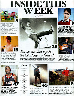
This contents page from Rolling Stone magazine caught my attention because of its interesting layout. Unlike other contents pages, a number of articles are highlighted and made known to the reader at this point of the magazine, and so we can assume that these features are what the audience are going to most enjoy (usually only the cover story is featured on such a large scale, whilst the rest of the pages are mentioned in smaller text, although the magazine above is on a similar wave length). The use of images for each of these pages accentuates the reader's interest and makes each section stand out. The image in the middle is the largest, which suggests that this is supporting the main feature article, and also indicates where to turn at first glance. The background is basic, once again, but the images and splashes of colour make the page look full of information and prevent it from looking bland. With so many images on one page, this could create a very busy look and the reader may be left confused, however the borders around each ensure that they are separate from one another. The 'Plus' section also provides references to other pages which may not be as popular with the reader, but still indicate what else is in the issue.
This contents page from Vibe magazine caught my attention because of its simplicity and unique layout. Only one artist is featured on the page, in contrast with the previous contents pages I have analysed, which draws the eye to a single image, allowing for a bold background colour to be chosen without cluttering up the page and adding to the issue's simplistic design. Again, not every single page is mentioned, but the text is all the same size and only the main cover story is made known to the reader at first glance due to the image.
The title 'contents' is also interesting because the word is spaced over three separate lines, as it were, and adds to the unique style of Vibe magazine.
This contents page from NME magazine caught my attention because of its common colour scheme and rough, 'edgy' look. Rock music is usually associated with the colours red and black, and so by incorporating this colour scheme in their magazine, NME have effectively 'hit the nail on the head' and should have appealed directly to their target audience. The fact that this is the most common colour scheme used in the creation of magazines will also ensure that the page will not look too overwhelming, as the colours as simple yet striking. This magazine also only has one image, but the photo of the Arctic Monkeys is significantly smaller and is sectioned off from the background of the page, allowing space for a summary of the cover story, and also drawing more attention to the other pages which have been mentioned down the side of the contents.
There is a flash of yellow text at the bottom of the page, which will attract the reader to the advert promoting a subscription to the magazine, which will therefore gain more readers for the magazine.
This contents page from Kerrang! magazine caught my attention because of the main image, the colour scheme and the title. The image of a 'wild' gig will automatically entice the reader into purchasing the magazine and reading on, as it portrays something exciting which may interest them, and the fact that this is the largest image on the page suggests that Kerrang! also believe this to be true, and so have chosen this to be the main feature of the magazine. The colour scheme is once again predominantly red, black and white, but some yellow text is also included, as this stands out from the background. Two smaller images are included with page numbers referring to the part of the magazine the articles are featured, which will attract readers to the rest of the issue as well.


No comments:
Post a Comment