Showing posts with label ideas. Show all posts

Thursday, 14 February 2013

Sniffin' Glue Magazine


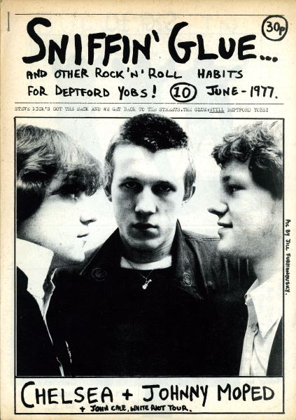
I also really like the look of Sniffin' Glue magazine, and although I had not planned on making my magazine in black and white, I think that maybe this is something I should consider. I like the typography used which looks like it has been scribbled on really quickly, and also the cut & paste style layouts. The images look very rough and uncut, which would fit in with the genre of my magazine, and the general untidiness of each cover, especially the 'punk special', works well and is still clearly readable despite this. Each issue has the same general layout - masthead etc. at the top, image in the middle, subheadings etc. at the bottom - although the 'punk special' changes this slightly by crowding the middle section, which I think looks amazing and could potentially be a design that I base my next draft on. I like the random placing of the text and the different fonts, and because the image is simple, this does not make the page seem too busy, either. I think with the right use of colour and image, this could look fantastic.

Wednesday, 13 February 2013

Ray Gun Magazine


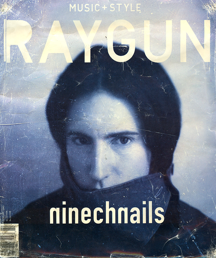
I like the style of Ray Gun magazine and hope to base my final product on their designs, simply because they are so unique and striking. Ray Gun (when it was around) broke the generic conventions of a typical magazine cover more often than conforming to what was most common, but their covers did not look poorly put together despite this, which is one of the main things I love about them. For example, the first of the two Elvis covers has an extremely strange layout in that the title of the magazine is not the biggest piece of text on the page, the image is not centered and cannot be identified easily, and the positioning of the typography and also the barcode do not resemble a classic cover, although this still works somehow and appealed to a certain audience; one similiar to mine, I presume, due to the styles and feature stars used. The other Elvis cover creates a mirrored effect and incorporates bold colours with a neutral background to ensure that the space is not cluttered, as well as positioning text and barcodes in strange places, once again, but making it look enticing and quirky rather than wrong. I like the Iggy + Perry cover because of the grunge look it portrays, which is created by the green tint used to enhance the simple image, as well as the masthead, and the dirty looking, contrasting dark/light colour palette in general. I also like the layout of the white cover, which completely throws traditional magazine layouts out of the window and places an image at the top of the page and fills the entirety of the bottom with cut & paste style text. Most stick to white and black text and then use a colourful background, which is what I wanted to do with my magazine, although I couldn't do this for my draft due to time and the clothes my model was wearing, which I think works well and stands out. The choice of fonts used throughout are all amazing, in my opinion, and because the images are not busy, this allows for bold colour choices and typography. I will refer back to this post when I create another draft.

Tuesday, 12 February 2013

Magazine Playlist

I have composed a playlist of songs which I feel best represent the influences, ideas, style, genre, mood, aesthetics, vision etc. of my magazine, as I felt that I had not expressed fully what I intend to achieve. Some of the songs I have chosen specifically fall under the category of 'punk' music, which was the vibe I was originally going for, although I think that this would limit my audience slightly, and so I have included some heavier songs and also some more alternative/pop songs, so as to attract a wider audience.

1) My Songs Know What You Did In The Dark / Fall Out Boy 2) Now / Paramore 3) Fascination Street / The Cure 4) The Wind Blows / The All-American Rejects 5) Kill The DJ / Green Day 6) Little Death / You Me At Six 7) Settle Down / No Doubt 8) Too Many Devils / The Bronx 9) Dead Man's Shoes / The Virginmarys 10) Shadow Moses / Bring Me The Horizon 11) Boom Shake The Room / The Blackout (cover) 12) Feeling This / blink-182 13) Kill Me / The Pretty Reckless 14) Breed / Nirvana 15) White Riot / The Clash 16) Blitzkrieg Bop / The Ramones 17) Liar / The Sex Pistols 18) In Too Deep / Sum 41 19) What You Want / Evanescence 20) Alpha Omega / Architects 21) Radiosurgery / New Found Glory 22) Like It's Her Birthday / Good Charlotte 23) Hey Supertstar / Madina Lake

Sunday, 3 February 2013

Pitch Feedback


When pitching my magazine idea to the class, I wasn't given much praise nor many criticisms, I think mainly because the class had very different ideas to me and were not as interested in my chosen idea as much as the others, as they didn't tend to listen to the genre of music I was going for and so didn't know what to expect. They mainly asked questions which I couldn't answer yet, although a few of my friends said that my idea was unique and caught their attention. My teacher thought that a punk rock magazine was a 'fresh' idea and I could pull it off well if I put enough effort into it, which is what I am aiming to do. I hadn't come up with a name at this stage, but I have now decided to call my magazine 'Jaded', as it means 'dulled or satiated/worn out or wearied', which is expressive of how my target audience may generally be feeling, and my magazine will aim to give them something new, as well as being the title of one of Green Day's songs from the punk rock album American Idiot, which is the kind of music I will be putting out in this magazine. I hadn't given much thought to how many pages I would include in my magazine, or at what price I would sell my magazine and how often it would be sold, but considering the fact that Kerrang! magazine has an average of 60-70 pages per issue and sells each for £2.20 and is printed on rough paper, I think a price of £2.99 for a 100 page magazine of the same quality would be reasonable. However, although Kerrang! is sold weekly, I think I would sell mine fortnightly instead, as the amount of detail would be hard to achieve weekly. Q magazine is sold monthly and is printed on glossier paper, which reflects its price of £3.99 per issue of about 166 pages, and so I think that this confirms that my decisions have been made justly. There was some confusion as to what kind of music would be featuring in my magazine, as my pitch stated 'punk, alternative rock', but I think that my previous posts have cleared this up a significant amount and the vagueness of the genre is what will interest my readers, as my magazine will feature a range of music influenced by bands such as The All-American Rejects:

and blink-182:
as well as bands such as Nirvana:

and Ramones:

I informed my teacher that I had a friend in mind to pose for the front cover of my magazine, as she fits the look I am going for without much alteration, and that I would take photographs of her and another two band members for the contents page and double page spread. Due to cancellations I have not been able to take any photographs at present, but this is something which will be done very shortly. I want to have only one person on the cover of my magazine so that it doesn't appear cluttered, but the abstract font choices and a bold background colour will be sure to make it eye-catching and stand out, despite the minimalistic style that I hope to achieve. I will take photographs of my cover star on a bare background, so that editing later on will be much easier, and I will hopefully take photographs of the band as a whole outside if the weather will permit it, against a graffitied wall or an old building, or possibly even in a wooded area, so as to make the band seem rebellious and interesting, although if this cannot be done I will take similar photographs for the contents and the double page spread as I will have done for the cover.