Showing posts with label cover. Show all posts

Saturday, 16 March 2013

Final Changes to Cover


As I liked the way my cover looked for the most part, I only made a few small changes to it. I felt that it was too blank and there were too many gaps around the edges, and so I added some text down the sides to fully capture the chaotic style of the hand-made punk fanzine I was going for.

Monday, 4 March 2013

Draft Alterations


As there were conflicting opinions about the use of the word 'cool', I changed it to 'real' which was suggested to me by one of my teachers. However, my other teacher felt that the use of the word 'cool' was ironic and witty, as I had previously used the word 'outcasts', which suggests that my target audience are not going to be the 'cool' ones, and so I made the decision to go back to this. I also changed the size of my barcode as I felt it was slightly too small.

Thursday, 28 February 2013

Draft #2

As previously said, I was unhappy with my draft cover, and so I have constructed another draft in a more preferred style. As also previously said, I really liked the 'punk special' issue of Sniffin' Glue magazine:


and so I have based my new draft around this design. The centre image of the female model was taken recently in my second photoshoot, whilst the other two images of the male models came from my first photoshoot. I pieced them together quickly just to get an idea of how I wanted my cover to look. 
As I didn't have the required technology at home, I had to use several websites such as picmonkey.com to edit the images, and I finally pieced them together on Microsoft Powerpoint as it was the best software I had to offer from home. I then decided to draw the text on, rather than typing it, as I couldn't download any fonts which suited the style I was going for. I then showed my initial design: 


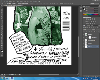
to one of my teachers so as to get a second opinion; and because he said he liked it a lot, I created a proper draft on Photoshop, using the Bamboo Pen tablet which enabled me to still create a drawn on effect although it was entirely done vitrually. This is my second draft, created on Photoshop:


  I like everything I have done so far, although I feel that there is too much space left uncluttered down the sides, as I am going for a busy and slightly edgy look. I stuck to what I had originally come up with, although I left out a few pieces of text which I felt needed to be altered better to fit my chosen style, though this clearly needs to be added back in upon deciding how I want the cover to read, and decided to add a green tint to my cover image so as to create a 'grunge' look, as I thought black and white was a little boring, as well as adding a price under the issue details. 
My magazine is not targetted at the majority of youth culture, and therefore, I think a little chaos within the layout and the typography etc. is entirely appropriate and would result in creating something fresh and different and would break the conventions of a typical music magazine, hopefully in a good way. However, I think I should incorporate some existing fonts as well as using my own hand, as nothing seems to jump out at the minute and I think a bit of variation would make it look more interesting (which is something Sniffin' Glue have achieved). 
I will organise another shoot with all three of my models as soon as possible, so as to be able to pick an image which will best reflect my magazine as a whole and have a few more to choose from.

Friday, 8 February 2013

Completed Draft Magazine: Self Review


Despite slightly veering away from what I had originally wanted to achieve with my first draft, I think that these designs work well enough and are okay for a mock. As my cover star was wearing a red top, I couldn't have a colourful background much like I wanted, nor could I use purple, and due to lack of time I couldn't create any amazing visual effects, and so left my photos unedited and didn't think about the new colour scheme as much as I could have done. My front cover began as my flat plan had indicated, but one of the teachers in the Media department gave me some advice whilst adding the final touches, and so this changed last minute. I was originally going to use the photo of my model with her fist in the air, but I was told that it didn't make the layout easy to work with because it wasn't a central image. I was also told about the different styles of layouts and that an 'F' layout would work best with the image I had, and so I placed the text accordingly to fit this style, although I may stray from this when creating another piece as I want to be experimental. I didn't realise that I couldn't use the masthead font throughtout, and so choices of different fonts were rushed and not well thought out after I became aware of this. The idea of having text placed over a block of colour (specifically a black rectangle) was brought to my attention by Kerrang! magazine, and almost my entire contents page was influenced by NME magazine. My double page spread was once again influenced by Kerrang!, and after making my article a bit longer and adding some pull out quotes, I don't think that there are many alterations I would still need to make, other than choice of fonts and colours, as I think the style of image and layout work well together (unless I decide to change the layout completely). I don't want my contents page to look boring, and so I will not stick to a black, white and red colour scheme next time, as I think this is done too often, but I think it fits in nicely with a genral rock theme. I don't like the text underneath the image because I think there isn't enough of it, but I think that there is too much text down the side, and I will research into some different contents page designs so that I can create a unique, new style. Overall, I think my draft magazine gives off a very Kerrang! vibe, despite the fact that there is limited text on the front cover, which is something I will try to stay away from next time, as I want my magazine to look a bit more quirky and classic 'punk', rather than mainstream pop rock and 'emo', and so I will take some ideas from the 80's and the 90's magazine Ray Gun, although recent music will heavily feature and this will include a range of different rock music. I think that this will work better than what I have done because it will be similar to Kerrang! but will also be completely different.

Monday, 28 January 2013

Step By Step Magazine Cover


I decided to quickly produce a mock magazine cover in a few simple steps, so as to get an idea of what I could do within a certain amount of time. I think that this cover looks quite good due to its minimal layout and fits in with the genre of music that I am focusing on, although given more time, there are certainly things I would do differently. I like the masthead font and colour, although I think it should possibly be a little bigger, as this will attract the reader's attention more. The date and issue number are placed and sized accordingly, in my opinion, and the font works well. The header, however, is positioned at a strange angle, and the sub header is barely visible due to choice of colour, although it  was an attempt at incorporating a black, white and purple palette. I think the barcode and the price have been constructed okay, and the image itself is striking and eye-catching.

Friday, 18 January 2013

Preliminary Task: Photoshop (college magazine)

The final cover I created for my preliminary college magazine:
 
 
The layout of the cover is much the same as my flat plan idea, although I decided to leave out some of the text I had planned, because I thought this would make the cover look too cluttered and would take away from the simplistic example I was going for.
I decided to use a quirky, yet simple and readable font, so as to appeal to the target audience, and, also due to the genre of the magazine, I placed an image of a student central to the piece.
I chose the colour scheme - red, white and black - so as to keep in tune with what was most common, as I thought this would be my safest bet to begin with. Although, my model was standing in front of a grey background when I took this photo, and so I decided to keep this as an extra colour tone, as I thought it pulled away from the common look slightly but still looked professional. Due to what the model is wearing, however, I don't think the colours I have used for certain pieces of texts are suitable and clear, and so this is something I can learn from and will have to be aware of in the future.
 
The final contents page I created for my preliminary college magazine:


The layout of the contents page is a lot different to what my first ideas were, as you can see from my flat plan. This was mainly due to the fact that I had not taken enough photos to begin with, and so I could not go through with what I originally had planned. I feel that the contents page does not look too different from its front cover, however, and is once again simple in its layout, and so this was not a complete loss. Next time, I would place the text differently, as it is obscuring the image from the reader's view slightly, but due to my lack of Photoshop skills at present, I had to use this photo for the background of the whole page, and so there was not much room to place the text accordingly.
I kept the colour scheme the same, which I think works well, but some of the text is barely visible, as before, and so I would have to think more clearly about this next time.