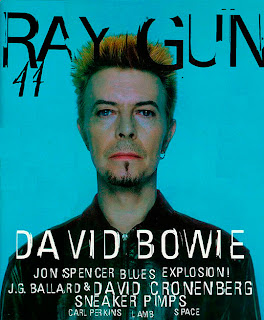
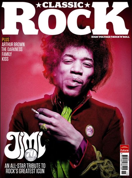
After contemplating what kind of look and genre of music I wanted to focus on, I have decided to go for an edgy, punk rock, alternative style. Despite the use of the word 'punk', I am not limiting my magazine to just this, but all kinds of rock in general, e.g. post-hardcore bands like The Blackout, alternative rock/pop punk bands such as You Me At Six and Paramore, ska punk/reggae fusion bands like No Doubt, metalcore/deathcore bands such as Bring Me The Horizon and Architects, as well as punk rock/pop punk bands like Green Day.


I like these covers because they are quirky and incorporate bright and contrasting colours, some of which seem almost psychedelic, fitting in with the 'punk' theme, and use striking images or backgrounds which attract the reader's attention. A range of different fonts have been used which I think fit in with my chosen genre, and the amount of text on the pages differ, which will allow me to play around when creating my own magazine, as I can base my cover on any of these designs. I particularly like the David Bowie cover of Raygun magazine and will possibly choose a font along these lines and maybe a plain yet striking background of a similar style. I like the unique layout and placement of text used on both of the other Raygun covers, and the familiar black, white and red colour scheme used on Metal Hammer's cover, as well as the almost drawn on text, whilst also incorporating a striking yellow colour, popular amongst rock magazines, which is also found on the NME cover, which contrasts nicely with the purple/pink background and white text. The background image of the Q cover is very artistic and colourful and gives the magazine a 'fun' look about it, as well as its bubbly choice of fonts. The Select magazine cover is similar to the Ray Gun issues because of the date it was published, but I think that these colour choices could still work nowadays when targeted at punk rock lovers; and the Jimi Hendrix Classic Rock cover stood out for me because of its limited yet bold colour scheme but dominant image and the use of a 'hippy' style font.


No comments:
Post a Comment