
This cover of Vibe magazine caught my attention because of the colour scheme and visual effects. The effect used on the image almost draws the eye to the masthead and the header, rather than the model, blending the image into the background slightly, but creating a stylish effect. The face of the model has been altered to match the background colour (white), so as to make the bright blue and pink text stand out. This particular issue is called 'The Style Issue', and so a feature on 'The 31 Most Stylish Stars' is promoted on the cover, as well as some of the candidates, to attract an audience via their celebrity interests. This will also attract an audience because the magazine knows that they will want to take note of what these celebrities are doing that is so 'stylish', in order to be just like them. The layout is extremely simple and except from the text along the sides of the cover, there is only the header, which is focused on the model and main story.

This cover of Classic Rock magazine caught my attention because of its focus, the main band featuring in the issue, but also because of its 'classic' monochrome style. The cover is slightly dull and 'hard' looking, with its dark grey background, which fits in with the genre of the magazine, but the white and gold text stands out from this and almost glamorizes the whole thing. The masthead and the header are quite large, which emphasizes the 'power of rock', but also leaves little space left for other text, which gives the magazine its 'classic' look. Few other bands are mentioned on the front cover, but not on the same scale as Metallica, and so we can assume that the magazine is trying to attract readers by the main cover story, as most tend to do. The only flash of colour exempt from this is the image of the yellow guitar plectrum in the corner, which is promoting a free gift in red text (another bold colour). This is another incentive for the reader to purchase the magazine.

This cover of Complex magazine caught my attention because of its simplistic yet busy design. The fact that there is very little text at all, emphasises the image which fills the whole cover, which hints that it should look very simple, although it doesn't, due to the colour scheme used - black, white and purple. The cover stands out, but looks stylish at the same time. Even the masthead, which is the same colour as its background, stands out. The designers have played around with the idea that it's the magazine's '10th Anniversary Special', and have placed the '10' over the model's eyes, but they have done it in such a way that it fits in with the stripes found on the lollipop and the model's tongue. The header 'Too Much Ain't Enough', which sums up Nicki Minaj's career, is also the reasoning behind the eye-catching cover, and the two mirror each other, catching the reader's attention. The magazine is relying on this idea to sell, as nothing else featuring in the magazine is mentioned, which shows that some magazines do well predominantly because of the celebrities they feature.

This cover of Billboard magazine caught my attention because of the main image, colour scheme and layout, which are a lot different when compared to the previous three magazine covers I have analysed. The fact that the image is placed in front of the text, rather than behind, shows that this magazine's main selling point is definitely the star on the front. The image is even covering the masthead, which suggests that Justin Bieber is more popular than the magazine itself. Three very bold colours are used on this cover, whereas others tend to use two at the most, which makes the text stand out, despite the fact that the image covers some of it slightly, and other artist's names jump out at the reader, without taking any of the focus away from the cover star. With regards to the layout, the cover is very busy, but this time due to the amount of text used, rather than a consuming image filling up all of the space.
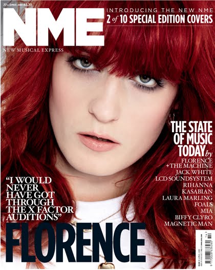
This issue of NME magazine caught my attention because of the colour scheme and its simplistic design. The colour scheme is limited to white and navy, although the colour of the model's hair is a rich red and fills the background of the cover, therefore catching the reader's eye and making the text stand out. The fact that at the top, the header reads 'Introducing the New NME' and '2 of 10 Special Edition Covers' will give the reader an incentive to buy the issue, and the others that will follow. Different fonts are used for different bits of text, for example, the quote from Florence is bold, because it accentuates the star of the cover story, but is not as bold as 'THE STATE OF MUSIC TODAY', which seems to be the focus of the issue (and the other 9), and the text underneath which shows the other artists which are 'examining' this have been written in an even less visible font, because although this particular issue is not featuring them, the reader can expect to see them in the issues to come.

This issue of Q magazine caught my attention because of its colour scheme and choice of fonts. Like the previous magazine, it is part of a series of issues, this time focused on 'THE MUSIC THAT CHANGED MY LIFE', and so the artists featured are also mentioned in small text down the side, but the star of the issue, Jessie J, is featured on the cover, although as a full body shot, rather than an extreme close-up as before, and the header to go with this is a different colour to the others and is a considerable amount bigger as well. The paleness of the background allows for the magazine's masthead to stand out, as well as the bright pink text and pale blue background behind certain text, thus accentuating the focus of the issue.
The font of the text is also interesting, as the featured artists in the series are written in an almost handwritten font, so as to appeal to a younger audience, whilst the star of the issue is written in a bold font so that it's clear.

This issue of Kerrang! magazine caught my attention because of the colour scheme, the cover star and the layout. Having owned this issue myself, I know that I bought it because Paramore were to be heavily featured inside, although the cover will have sold the issue for many other reasons. With the main colour scheme of the cover being black, white and yellow, the text matches the colour of Hayley Williams' top, whilst the black and white portray the 'hardness' of the genre, and despite the layout being quite busy, the plain background means that the text and images are clearly visible. Unlike the other magazine covers I have analysed, this is the only one to feature more than one image on the front cover. Kerrang! is known for having a number of posters inside, and so images portraying a few of them on the cover is an essential part of their selling point.
No comments:
Post a Comment