

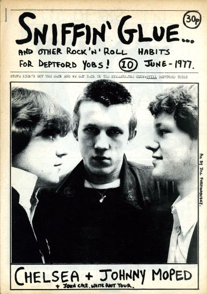

I also really like the look of Sniffin' Glue magazine, and although I had not planned on making my magazine in black and white, I think that maybe this is something I should consider. I like the typography used which looks like it has been scribbled on really quickly, and also the cut & paste style layouts. The images look very rough and uncut, which would fit in with the genre of my magazine, and the general untidiness of each cover, especially the 'punk special', works well and is still clearly readable despite this. Each issue has the same general layout - masthead etc. at the top, image in the middle, subheadings etc. at the bottom - although the 'punk special' changes this slightly by crowding the middle section, which I think looks amazing and could potentially be a design that I base my next draft on. I like the random placing of the text and the different fonts, and because the image is simple, this does not make the page seem too busy, either. I think with the right use of colour and image, this could look fantastic.
No comments:
Post a Comment